|
|
Post by Katastrophe St. John on Dec 29, 2008 8:16:27 GMT -7
He looks like a very dirty Peter from Heroes... and those look nothing like cement bricks.
Purple basket weaving.
|
|
|
|
Post by Shikon on Dec 29, 2008 9:19:56 GMT -7
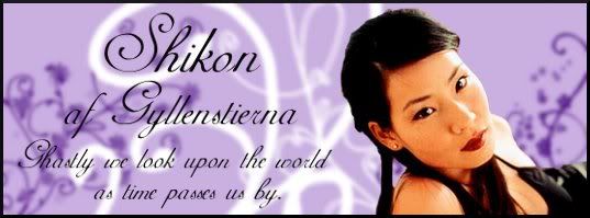
The purple sort of reminds me of a macrame plant hanger my grandmother had...
|
|
Vex
Bloodsucker
 Psycho
Posts: 36
|
Post by Vex on Dec 29, 2008 21:29:24 GMT -7
What about mud wrestling?
I also refuse to make anything else. Ever.
|
|
|
|
Post by moons on Dec 30, 2008 6:18:17 GMT -7
I'll produce a background once I get a bit of free time in.
|
|
|
|
Post by Shikon on Dec 30, 2008 7:51:09 GMT -7
I didnt say I didnt like it.. I rather like the purple macrame thing
|
|
Vex
Bloodsucker
Psycho
Posts: 36
|
Post by Vex on Jan 1, 2009 22:11:07 GMT -7
I was kidding... I know the background's terrible, but it's actually grown on me. *Stares at it a bit*
Josh, you're still missing buttons, namely the reply one.
|
|
|
|
Post by moons on Jan 1, 2009 22:47:01 GMT -7
I'll upload them in a bit.
|
|
|
|
Post by Persephone on Jan 1, 2009 22:58:50 GMT -7
I wondered on that >.>
|
|
|
|
Post by Jung-Hwa Park on Mar 26, 2009 10:34:33 GMT -7
Hm. May I suggest something less image-loaded? Something simple black and white? 50% of the time I'm loading on from a foreign machine which is as slow as a brick, and the images are tedious to load. I've since blocked everything, but since the images are all hosted on the same account, I sort of screw myself over by having NO images/buttons. This is why I'd suggest something relatively neutral and boring, based on the template of proboards... as an option for those of us who don't like all the fancy stuff. Also, the font seems to be a problem on every laptop I'm using (yes, more than two XD), there's not enough contrast. It'd be nice if the red in Blood Moon was closer to CC000/FF000 than what it is now~ a murky maroon/red that blends in with the background... and for the Purple skin, if the grey could be closer to white than dark grey, that would be awesome... Here are a few links I tend to resort to each time I make color decisions for design: www.december.com/html/spec/color.htmlcloford.com/resources/colours/500col.htm |
|
|
|
Post by Persephone on Mar 27, 2009 15:04:22 GMT -7
Hmm, I can work on a simpler new one for that, but the two that are standing now won't be changing. The consensus was gray is better than white, the white was too much contrast.
|
|
|
|
Post by Persephone on Mar 27, 2009 15:25:37 GMT -7
Ok, I created the "Whitey" skin. It's black, white, and two blues, and has no special images. Let me know if that works better for you!
|
|
Vex
Bloodsucker
Psycho
Posts: 36
|
Post by Vex on Mar 27, 2009 16:11:06 GMT -7
The purple skin was never finished. *shrug* The only image that would be a problem to load would be the top one and the annoying red "Welcome" butterfly thing. I made the buttons and uploaded them using dial up on a terrible computer, so its not the button images bogging you down.  |
|
|
|
Post by Jung-Hwa Park on Mar 27, 2009 17:18:10 GMT -7
Ok, I created the "Whitey" skin. It's black, white, and two blues, and has no special images. Let me know if that works better for you! That's very cool. I like it. Thanks. |
|
|
|
Post by Kunna Drakonis on Jan 5, 2010 10:27:41 GMT -7
I created a new one thats rather basic but there are image buttons. Also, there is a new header...but I wasn't sure if I could or how to delete that (sorry Josh) rather annoying red welcome image.
It's called Lips.
|
|


 OOC: Blair|:-